In the time we’ve spent with the Moto 360, Android Wear running on the watch received the 5.0 Lollipop update. This helped us evaluate the improvements made to Android Wear while reviewing the Moto 360. ![]() Design and display
Design and display
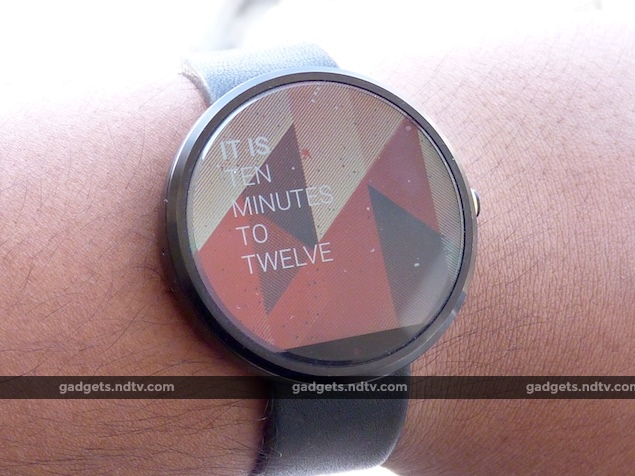
Before watches became smart by housing tiny little computers inside them, their primary purpose was to tell the time. Watches also usually make some sort of fashion statement. Unfortunately, smartwatches haven’t managed to get past their drab designs just yet. Motorola’s round Moto 360 is a great departure from the boxy designs of the LG G Watch and Samsung Gear Live, and it looks really attractive except for the black bar on the bottom of its face. This means that the watch face is not fully circular. The LG G Watch R, introduced immediately after the Moto 360, has a fully round design – but more on that when we get our hands on a review unit.
The black bar, often referred to as the “flat tyre”, houses an ambient light sensor and the LCD drivers. We are not fans of this approach as it is looks like a design flaw, although once we got used to wearing the Moto 360, the black bar did not feel as distracting. The watch has a metal casing with bevelled edges. Even the (almost) edgeless display, made of Corning Gorilla Glass 3, has bevels. There is only a single button on the right, which was accentuated by a golden ring on our review unit. On the back lies the heart-rate monitor which glows green when activated. Motorola’s charging dock is a rather cute piece of hardware and the visual signifying that the Moto 360 is charging looks futuristic. ![]() Motorola offers two types of straps – leather and steel. The company commissioned a renowned leather brand called Horween to make the straps for the Moto 360. In India, the leather strap is available in grey and black, though steel straps aren’t available yet. You will have to head to a watch repair shop to get the straps changed because the process to remove it is not simple.
Motorola offers two types of straps – leather and steel. The company commissioned a renowned leather brand called Horween to make the straps for the Moto 360. In India, the leather strap is available in grey and black, though steel straps aren’t available yet. You will have to head to a watch repair shop to get the straps changed because the process to remove it is not simple.
The leather feels soft and really comfortable. At 49g, the Moto 360 is super light despite its size. We didn’t feel that it was abnormally huge, although if you have small wrists, the Moto 360’s size might be a bit of a deterrent. Like an ordinary mechanical watch, it feels inconspicuous and we barely noticed it on our wrists.
The screen on the Moto 360 is a 1.56-inch backlit LCD with a resolution of 320×390 pixels, which works out to a density of 205ppi. Arguably this is not a dense display but we were pretty satisfied with its colour calibration and brightness. The sunlight legibility is pretty decent and viewing angles are not too bad either. Pixellation visible along the edges is a huge distraction. The Moto 360 doesn’t have an ‘always-on’ mode, which is a bit of a letdown. It makes up for this with an ‘ambient light’ mode that shows outlines of content. Of course, switching on this mode takes a toll on the battery life.![]() Specifications and performance
Specifications and performance
Motorola has swapped the Qualcomm Snapdragon 400 SoC we’ve seen other brands use for a Texas Instruments OMAP 3. The watch has a 320mAh battery, which is in between the Samsung Gear Live’s 300mAh and the LG G Watch’s 400mAh batteries. The Moto 360 has 512MB of RAM and 4GB of internal storage space for apps and music. ![]() In ordinary usage, our touches and swipes registered accurately most of the time on the Moto 360. However, we feel that the Snapdragon-based models are snappier (even though only one of the available four cores is used) and on quite a few occasions, the Moto 360 just wouldn’t respond to our actions. The dual microphones are quite attentive and ready to listen to commands such as “Call Mom”, “Navigate to X location”, or “Play a song”.
In ordinary usage, our touches and swipes registered accurately most of the time on the Moto 360. However, we feel that the Snapdragon-based models are snappier (even though only one of the available four cores is used) and on quite a few occasions, the Moto 360 just wouldn’t respond to our actions. The dual microphones are quite attentive and ready to listen to commands such as “Call Mom”, “Navigate to X location”, or “Play a song”.
The most contentious topic for the Moto 360 is its battery performance, which could have been better. With ambient mode off we repeatedly clocked only around 16-18 hours of battery life before it needed to be placed on its little dock. Ambient mode saps more juice. Also, you’d be well advised to keep an eye on third-party apps because a few of them can sap battery life. For example, we noticed that our Moto 360 lost a lot of power when we used Swipify. ![]() Android Wear 5.0
Android Wear 5.0
Android Wear 5.0.1 Lollipop is now more polished with tweaks that allow for more flexibility, but also adds more swipes and taps to the whole process of using a smartwatch. Motorola has also added its own Moto Body app, which is an alternative to Google Fit.
At the heart of the experience are the Google Now cards that peek up from the bottom of the watch face every time a notification comes in. You can pull a card up to view the notification, click on it to see more information (if available), swipe right to view actions (if available), and finally swipe further right to open the originating app on the phone or block notifications from the app. For example, messaging apps usually offer the option to send short preset responses or dictate a reply. All this works like a charm most of the time despite ambient noise, which makes the smartwatch experience feel natural. ![]() Swiping down from the top shows a few new options now. You can completely mute notifications, or if you’ve paired the device with a phone that is also running Lollipop, you can use notification priorities to tailor the flow according to your preferences. Google adds new ‘theater’ and ‘sunlight’ modes that can be used to completely turn off the screen or trigger maximum brightness, respectively. A Settings section has more controls including triggering the ambient mode, changing the watch face, and resetting the device.
Swiping down from the top shows a few new options now. You can completely mute notifications, or if you’ve paired the device with a phone that is also running Lollipop, you can use notification priorities to tailor the flow according to your preferences. Google adds new ‘theater’ and ‘sunlight’ modes that can be used to completely turn off the screen or trigger maximum brightness, respectively. A Settings section has more controls including triggering the ambient mode, changing the watch face, and resetting the device.
If the screen is only showing the watch face, you can trigger Google Now by saying ‘OK Google’ or clicking on the centre of the screen. Quite a few voice commands are available. The ones we wound up using most often were to show directions to a particular location and play music. You can also choose to click on individual options from here. ![]() Google has opened the watch face API to third-party app developers, which is great because we had a ton of fun just experimenting with creatively designed watch faces. Our only gripe is that Google doesn’t allow developers to move the “OK, Google” text around, and it stays bang in the center of the screen. Changing the watch face is pretty simple – you just have to long-tap the screen for the menu to pop up. The Android Wear companion app on the phone can also be used to change watch faces. You can add third-party apps, and our favourite by far was Musicxmatch, which would display synced song lyrics on the watch.
Google has opened the watch face API to third-party app developers, which is great because we had a ton of fun just experimenting with creatively designed watch faces. Our only gripe is that Google doesn’t allow developers to move the “OK, Google” text around, and it stays bang in the center of the screen. Changing the watch face is pretty simple – you just have to long-tap the screen for the menu to pop up. The Android Wear companion app on the phone can also be used to change watch faces. You can add third-party apps, and our favourite by far was Musicxmatch, which would display synced song lyrics on the watch.
All in all, the Android Wear 5.0 has a good number of improvements that make it better than the previous version of the software, yet the whole experience is far from perfect. While the card-based interface does look cool, we are still on the fence about its implementation. It feels messy and the learning curve is a little too steep. ![]() Verdict
Verdict
If you had to buy an Android Wear smartwatch today, we’d recommend the Moto 360 only because it looks so much better than the rest. Keep in mind though, that you will have to be alright with the black bar on the bottom, the iffy performance, and a battery that needs to be charged every day or two. That is a lot of tradeoffs for the Moto 360’s asking price of Rs. 17,999. The relatively drab LG G Watch is now priced at around Rs. 7,000, so if you only want to experience Android Wear, this is the more affordable option till something better comes along – which should not take very long.
Price: Rs. 17,999


