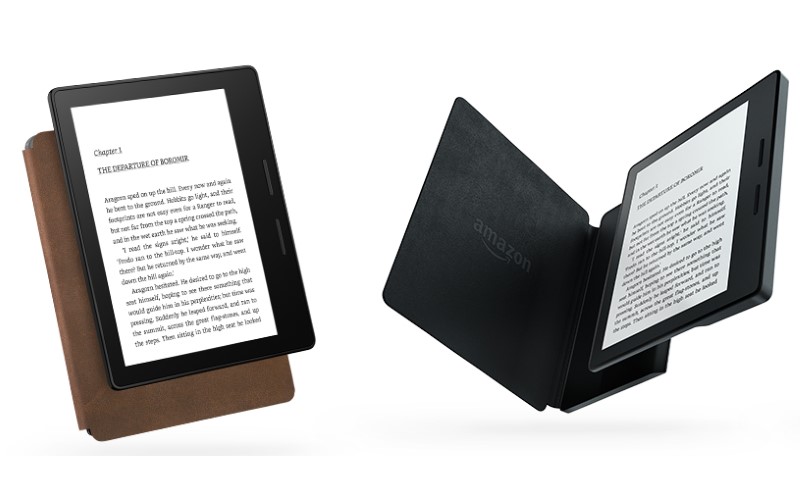
The Oasis, which started shipping this week, is meant to be a luxury ebook reader – a solid, top-of-the line device, when money is no object. It’s designed strictly for reading, without Facebook, streaming video and other distractions common on full-functioning tablets.
Though the Oasis has a lot going for it, I didn’t find any feature that sucked me in or won me over after a few days toting around three Kindles in New York. Amazon would have had a stronger case if its cheaper readers weren’t already good.
Here’s how the Oasis compares with the $100 Paperwhite (currently on sale from $120) and the $200 Voyage (Rs. 16,499 in India):
1. Comfort for reading
Unlike previous Kindles, the Oasis is designed for one-handed reading. One side is thicker, for a better grip, and the text flips so you can use either hand. At just 4.6 ounces (131 grams), the Oasis feels as light as a paperback.
Amazon executives say their goal is to make the device disappear so you can focus on the pages you’re reading. I found it a breeze to hold and flip the pages with one touch, either by touching the screen or using the page-turn buttons on the side.
But I also enjoyed reading with the Voyage and Paperwhite. I get lost when reading novels, whether it’s one-handed or two.
2. Better screen
Text looks crisp and bright on the Oasis, with a screen resolution of 300 pixels per inch. But the Voyage and the latest Paperwhite have that, too (The original Paperwhite was duller.)
All three also have built-in lights, but the Oasis is packed with more LEDs for a display that’s brighter and more evenly lit. The display adjusts automatically to ambient lighting. Reading in bright sunlight, I didn’t find the screen any brighter than the Voyage, but in a dim coffee shop, it did stand out.
![]()
The Oasis also offers more fonts to choose from, including a new one called Amazon Ember – meant for easier reading, as it removes the tiny strokes, or serifs, at the tips of letters. Frankly, I prefer the strokes, as printed pages typically have them. Ember is only on the Oasis for now, though older Kindles might get them later.
Because I spend my day at the computer, I don’t want to feel like I’m staring at a screen when reading. The Oasis is much easier on the eyes than a phone or tablet because there is no glare and the screen is lit from the front, rather than behind – as in directly into the eyes. But the Voyage and the Paperwhite have those characteristics, too.
3. A case packed with power
The Oasis comes with a leather case, in black, merlot or walnut, so you’re saving $15 (roughly Rs. 1,000) or so, presuming you’d be buying a case with a cheaper Kindle.
The case attaches to the Oasis with a magnetic snap and makes the device easier to hold. In fact, I prefer reading with the case, even though it covers up the thicker edge meant for better grip.
![]()
There’s a spare battery in the case, so you get nine weeks of reading combined, based on 30 minutes of reading a day. Though that’s more than previous Kindles, it’s not a crucial feature. It simply means you need to recharge it every other month rather than monthly.
4. Get more, pay more
The Oasis is sleek and chic, and given that it’s out of stock until June 1, it looks popular with at least some readers.
But it’s hard to overlook that price tag.
The basic version is $290 and comes with ads on the screensaver. Add $20 to turn them off and another $70 for 3G cellular connectivity, which allows you to buy and download ebooks when you don’t have Wi-Fi. The data plan is included. With the extras, the device costs $380, or about the same as a tablet with far more functionality.
Amazon’s other Kindles already provide a pleasant ebook reading experience. You could buy both a $100 Paperwhite and a $180 Fire HD tablet for the price of an Oasis, with $10 to spare for your first ebook.


