So when Microsoft came out with its first tablet computer, the Surface, I wanted and expected a machine that is good for work. After all, its Windows operating system runs most of the world’s computers, particularly in corporate environments.
The Surface is Microsoft’s first attempt at a general-purpose computer. In the past, it made the software and left it to other companies to make the machines. But to catch the tablet wave led by Apple’s iPad, Microsoft felt it needed to make its own device.
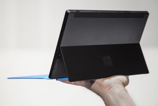
The Surface’s price tag starts at $499, the same as the latest full-screen iPad, but if you are going to buy one, you’ll want to spend the extra $100 or more for an optional cover that comes with a working keyboard.
After several days with it, I felt that Surface comes close to becoming a replacement for my work computer, but it doesn’t make it all the way. Some elements designed for “play” make Surface surprisingly good, while others verge on being frustrating.
Interface
There’s no doubt that Surface has a split personality, steeped in its very physical design. It’s a tablet, but transforms into a personal computer with the keyboard cover, snapped on using its magnetic spine.
Trying hard to be both means compromises. For instance, a kickstand lets you prop up the screen on a flat surface so that it feels more like a laptop with the keyboard attached, but the setup is clumsy for typing on your lap. On the other hand, you can flip the keyboard cover upside down and use the kickstand to form a supportive triangle for the screen. In this position, the device is a comfy companion while watching TV on the couch.
A big aspect of the split personality comes in the software. Surface’s start screen has a bunch of square tiles that represent apps – akin to the round icons on iPhones, iPads and Android devices. One touch, and an app opens full screen. But there’s also a tile that takes you to a very different operating system called the desktop. Presumably, this is where the “work” begins.
Because the desktop interface takes on the old Windows style of boxes and icons, your suddenly big-seeming fingers become less well-suited to navigating. I had to give up on touch and use the keyboard cover with its trackpad (The pricier Type Cover with real keys is far easier for typing than the soft, flat Touch Cover, by the way). Swiping around on the cover’s built-in trackpad quickly brings up the mouse pointer, whose precision you’ll both need and appreciate in the desktop world.
Work
The Surface that went on sale Oct. 26 comes with Windows RT, the slimmed-down version of Microsoft’s newest operating system, Windows 8. While I understand the need for a slimmer OS to run on low-power chips that extend battery life, RT makes the device clearly not a PC.
Although the device has Microsoft’s latest browser, Internet Explorer 10, third-party plug-ins that have helped power the Web for years don’t work correctly. I couldn’t get behind my company’s firewall because a Juniper Networks plug-in couldn’t be installed. IE 10 is meant to be plug-in free, but the Web hasn’t caught up to it yet. Devices with the full version of Windows 8 won’t have the same plug-in problem, Microsoft says. But a Surface with Windows 8 Pro isn’t due out for a few months.
Surface gives you free copies of the Office programs Word, Excel, PowerPoint, and OneNote, which is a big bonus. The RT versions of Office operate much like the full versions, but lack some meaningful conveniences such as the ability to email files as attachments with a couple of clicks. Microsoft says that’s because Outlook isn’t included in the package. Instead, Surface uses a program called Windows Mail, but it makes little sense to me why it can’t be integrated with Office.
Still, in my testing I was able to save and access Word and OneNote documents on Microsoft’s Internet-storage system, SkyDrive. As a result, I could access those files back on my office computer without the hassles of USB and other storage drives.
Play
Part of the “play” element of Surface should have been the joy of just getting around using the touch screen, but some things made it confusing.
At first, I didn’t have a problem with the need to swipe in from the edges to make certain options appear.
Swiping in from the right brings up several buttons including ones for searching, changing settings or returning to the start screen. When you first set up the device, an explanatory graphic pops up to walk you through it. You hold the device with both hands and the screen lengthwise, and you do the swiping with your thumbs. This is very different from the idea of holding the tablet with one hand and touching it with the other, which Apple’s iPad seems to favor.
Swiping down from the top lets you either discard an app completely (by swiping through the bottom of the screen) or create a split screen for multitasking (by pushing the app to the left or right until it snaps in place). Swiping up from the bottom brings up app-specific options.
The problem is swiping in from the left. When you do so, it takes you back to the previous app you had open. I was impressed with how snappy the tablet was flipping between programs.
But I got confused sometimes with websites. I wanted to go back a page, not leave the app completely. The difference between these two functions is swiping in from beyond the edge or swiping in from just near it. I often found myself in places in applications without knowing how to return easily.
Also, if you swipe back through apps quickly, you can zip past the one you want, but you can’t swipe forward to return to it. As a stopgap, you can swipe in slightly and then back out of the left side to get a list of previous apps. But this is not really intuitive and you have to be careful to touch the one you want when the list comes up.
This painstaking learning takes some of the fun out of having a tablet and makes it maddening to use at times.
Another quirk
The standard font was quite small, forcing me to hunch close to the screen to get a good look. You can scale up the size of everything in the desktop world, but not elsewhere. A function called Magnifier helps make small parts of the screen bigger, but at low resolution. And certain apps let you spread and pinch with your fingers to zoom in and out, but other apps don’t. The lack of consistency makes the touch interface less enjoyable.
One other niggling complaint: Even though the screen size should make for perfect widescreen viewing in the 16:9 aspect ratio common for widescreen television, some Netflix movies with wider ratios continued to be shown with big black bars on top and bottom of the screen, wasting valuable screen space.
One big thing Microsoft got right was music. Xbox Music gives you a really clean interface, with beautiful moving graphics, and a “Smart DJ” feature, which plays entire songs in rotation in a genre – much like Pandora. You can also play songs or albums from a catalog of millions; it’s free, with ads. In rare cases, you may get only 30-second previews because of licensing reasons, but those songs are also available for purchase from the app.
I liked how Xbox Music plays in the background. When you toggle the physical volume rocker, a little box with pause, forward and back buttons pops up in a corner and fades away quickly. That works with whatever happens to be using the speakers, including iHeart Radio. It allowed me to easily catch up on the morning’s news and my email inbox at the same time.
Smart Glass, a feature that allows the Surface and other Windows devices to interact with the Xbox, was interesting but at times confusing. For instance, when I tried swiping through a menu of available videos, games and Xbox apps, I swiped right to left, but the menu on my TV screen went left to right. Same with up and down.
Microsoft says this configuration was intentional based on user research. But for me, it gave the impression that this was not, as CEO Steve Ballmer promised, a delightful product “right out of the box.”
Conclusion
The software is far from flawless, but I’m hopeful it will get better over time as apps are developed and software bugs are discovered and fixed.
What’s important is that Microsoft got the hardware right – creating a light portable computer that has an ample number of fun features and a decent work environment. That combination could make Surface as addicting and as useful for extending the work day as the BlackBerry once was.
About the Surface
The Surface costs $499 for a version with 32 gigabytes, though about half of it gets taken up by the operating system and pre-loaded software. A Touch Cover costs an extra $100 when purchased with the tablet (It’s $120 separately). A Type Cover – with real keys – goes for $130.
For $699, you get the 64 GB version with a Touch Cover included.
The Surface is available only at Microsoft’s stores and website.
![]()
Microsoft Surface in pictures


