Milagrow rose to prominence a few years ago for selling tablets it called “TabTops” with crossover features such as USB host connectivity, but has since then been better known for its pioneering line of domestic and commercial robots. The company currently sells an impressive variety of vacuum cleaners (including one that doubles as a cloud-connected home security device), window washers, massagers, air purifiers and much more.
The tablet vision is still alive alongside, and we have with us today the Milagrow M2Pro, a compact 7.9-inch tablet with features that the company hopes will give it an advantage over bigger brands including Apple, Dell and Samsung. It isn’t aimed at the very lowest end of the market, which makes it all the more interesting.
Domestic brands haven’t made inroads into the tablet market in the way that they’ve taken over the low-end and mid-range smartphone space, so it will be interesting to see whether Milagrow can counter its competition with abundant features and low prices.
![]()
Look and feel
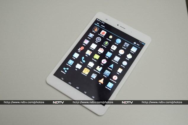
The M2Pro looks pretty ordinary. It has the rough outline of an iPad mini but you wouldn’t mistake one for the other. It’s made of white plastic but most of the back is covered with a thin sheet of aluminium. The front face is pretty blank since the tablet uses on-screen buttons. Only the earpiece, front camera, notification LED and sensor array are visible above the screen.
The headset socket, Micro-USB port and Mini-HDMI ports are all located in a cluster on the top edge, while the bottom is blank. The power and volume buttons are in a strange place – the bottom right corner. The buttons are a bit mushy and the volume rocker is especially inconvenient because of its tiny size. There’s also a pinhole reset button in one corner of the rear panel.
![]()
There’s a plastic flap on the upper right edge which is flush with the curve of the M2Pro’s back and conceals the SIM card and microSD card slots. The camera and flash are close to the top edge of the rear, and there’s a narrow speaker cutout on the bottom.
Most Android tablets have 16:9 or 16:10 screens, so the M2Pro’s uncommon 4:3 aspect ratio gives it squarer proportions than we’re used to seeing. That isn’t any problem, and the M2Pro is still relatively light and easy to hold.
We have to make a special mention of the M2Pro’s built-in vibrator. It’s meant to provide feedback when you tap anything on screen, but it’s so loud and powerful that it makes the tablet’s entire body rattle. Typing text became a somewhat amusing experience thanks to the constant buzzing.
![]()
Specifications and software
The M2Pro 3G is listed in some places online as “M2Pro 8.4”. This refers to its 7.9-inch screen and 4:3 aspect ratio, not the screen size itself in the way that some other companies label their products. The screen is probably the most disappointing aspect of this tablet – it’s large enough and the proportions are great for reading text and browsing the Web, but the resolution is just way too low.
The 768×1024 resolution is the same as that of the first-generation iPad mini, but somehow text appears more torn and lines are more jagged. Maybe we’re just too used to high-dpi screens now. Viewing angles are actually quite good. Colours are vivid but the screen gets completely washed out in sunlight.
![]()
The processor is a quad-core Rockchip 3188 which runs at 1.6GHz and has an integrated Mali-400 GPU. This isn’t by any means a speed demon but it’s relatively modern and should be powerful enough for HD video and a bit of gaming. There’s also 2GB of RAM, which is a healthy amount.
The M2Pro is available with either 16GB or 32GB of internal storage – we have the 32GB model with us for review. In addition to microSD cards up to 64GB in capacity, the M2Pro supports USB on-the-go and can mount hard drives of up to 2TB. Wi-Fi b/g/n and Bluetooth 4.0 are also supported.
![]()
The M2Pro runs Android 4.2.2 which is now considerably out of date. Milagrow seems to have tweaked it a bit, but not necessarily for the better. For some reason there are no icons on the homescreen – not even the basic camera and browser shortcuts – though you can pin these manually. Instead, an odd widget runs above the app drawer shortcut on each homescreen offering text links labelled Contacts, Telephone and Internet. It looks very strange, partly due to the aforementioned screen issues.
There are five soft buttons instead of the usual three – Along with the Back, Home and Recents buttons there are also two to adjust the volume. This is really odd, considering the hardware volume buttons are right next to them (when the tablet is held the right way up) and it also means that the buttons we actually need are all off to the left rather than their usual positions.
![]()
Android 4.2.2 doesn’t hide the buttons when they aren’t needed, so there’s always a black strip on the bottom of the screen. It does replace the buttons with dim dots in most full-screen apps – unfortunately the three dots do not correspond to the new five-button layout which means you hit the wrong button every time you need to exit a full-screen app. This is truly annoying and we cannot understand how Milagrow allowed this behaviour to pass.
The rest of the interface is stock Android – there aren’t any customisations to the Settings app, notifications shade or app drawer. You don’t get many preloaded apps – other than Google’s usual spread, there’s only a file explorer, wireless display control app, Super Video player (which lets you watch videos in a floating window above other apps), and an e-book reader simply called E-Book.
![]()
Camera
The M2Pro’s camera app is just about as bare as it’s possible to be. You only have control over the flash, white balance, exposure compensation, and image size. There are two scene modes – Auto and Night – and a separate Panorama setting.
The primary camera is rated at 8 megapixels and the front camera at 2 megapixels which are both above the norm for tablets. One issue we had is that the placement of the camera on the rear makes it difficult to hold the tablet without getting a finger in the way of the lens.
(Click to see full size)
Image quality was just about okay, but a lot depended on lighting conditions. There was noticeable inaccuracy in colours, loss of detail, and very poor exposure metering all around, but photos taken in daylight were especially overblown. Low-light indoor shots actually came out reasonably well – there was a lot of noise but details were discernible. The front camera is serviceable for video chats but not much else.
(Click to see full size)
Performance
Benchmark results were a mixed bag – we weren’t expecting much from the Rockchip processor but it did fairly well in AnTuTu and Quadrant, producing scores of 19,221 and 5,087 respectively. Graphics scores were pretty weak though – we managed only 5.4fps in GFXbench and 3957 points in 3DMark’s low-intensity Ice Storm test.
These scores are slightly higher than those of the Smartlink Digitab SS1078W, which is based on a Rockchip RK3066, the immediate predecessor to the 3166. Various other hardware differences could also account for the disparity.
That isn’t the whole story though. In our time with the Milagrow M2Pro 3G, we found that it stuttered and there was a bit of lag during screen transitions. This might be down to software optimisation, so we hope that things improve with future updates.
![]()
The battery lasted only 4 hours, 32 minutes in our video loop test which was rather disappointing. We didn’t test the calling features, but we did find that Wi-Fi reception was unusually weak.
We couldn’t get any of our 1080p test videos to play except the lightest MPEG4 file, and it stuttered way too much to be watchable. Even 720p video stuttered in places and skipping around the timeline resulted in very long lags. Sound from the built-in speaker was very loud, but just too thin and shrill.
![]()
Verdict
There are many tablets on the market which are more polished and user-friendly than the Milagrow M2Pro, but it still manages to offer decent specifications and features for its price. Most tablets come with only 16GB of internal storage space and lack 3G at this price.
In terms of user experience alone, even the now-ancient first-generation iPad mini is far better, but it only comes with 16GB of space, has no microSD slot, and sells for around Rs. 27,000 today. A much closer match would be the Dell Venue 8 which is also highly polished, achieves benchmark results, and matches the 32GB of space and 3G connectivity. It’s ordinarily priced at Rs. 25,000 but is currently selling for only Rs. 17,000. If you have the budget for it, the Google Nexus 7 (2013) 32GB with 3G and LTE sells for Rs. 28,000.
It’s really hard to recommend the Milagrow M2Pro 3G except in situations where price is the most important consideration. Ordinarily, we would strongly suggest that people set aside a little more money so they can afford a product which will be much more pleasant to use, or alternatively reduce their expectations. At this moment, the Dell Venue 8 is a much more attractive proposition and Milagrow will have to adjust its pricing to live up to its own value proposition again.


